Our.Umbraco.WysiwygGrid 1.0.0 beta released
A while ago I blogged about the state of WYSIWYG in the Umbraco grid editor. We're now about to add this script to a second and likely third Umbraco 8 site, so I had to generalize and package up the code.
There's nothing much to hide or earn from here, so I decided to put it up on github and nuget instead of our internal scm and feeds.
Hope to see some more community members fiddling with it, if nothing else that it inspires the block editor team to make the backoffice experience more similar to the frontend look and feel.
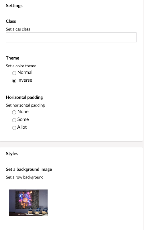
A definite change from the previous blogpost is that we favor grid settings over inline styling. By slightly modifying the bootstrap view (we use v4 anyway), we can add multiple classes instead of attributes as is done the original views. As such we can have settings like these:

Those will generate extra classes named padding-lots and theme-inverse.
Those classes are added to rows or cells in both the backoffice and the front-end.
By doing some fancy sass include ninjaing, we can hopefully limit the amount of duplication, while still mimicing the front-end as much as possible in the backoffice.
There are some samples in the github repo if you're unsure how to get started. The SQLCE database is included with a fairly common test username/password. 😇
Without further ado, here's the nuget and github links:
https://github.com/lars-erik/Our.Umbraco.WysiwygGrid
https://www.nuget.org/packages/Our.Umbraco.WysiwygGrid/1.0.0-beta01
Hope you enjoy it, and as usual, hope for a good discussion or feedback from the community!